
Where it all began …
In 2015, SEND (special educational needs and disabilities) Youth Advisors Surrey (SYAS) was first started. Some of our current members have been a member of this group for many years and have watched it grow and change over time!
Towards the end of 2020, members started consulting on the stigma surrounding additional needs and disabilities and associated Ablest language.
In particular, the acronym SEND came up:
“I try to forget that the special part exists. I don’t mind the term”
“Special should be replaced with additional needs”
“I think you should take the special out and put additional”
“It shouldn’t say SEND; it should just say additional. It is not just in school but out in society. People might make fun if they don’t know what it means!”
“Are additional needs alone enough? … I call myself disabled”
The naming of ATLAS
Summary: Members decided that they would like to remove the acronym SEND from the name of their participation group. Together they came up with a new acronym that they feel represents the values of the members. They decided on ATLAS: Accept, Teach, Listen, Access, Support
Members had time before session to think about the name they would like the group to have. Rowan Foster, a member of the User Voice and Participation Team and member of ATLAS, talks about how ATLAS became one of options she suggested in group:
“I wanted to go for a name that didn’t have any clear pre-existing meanings, or any negative connotations, because I thought it was really valuable that we got to define it ourselves, and I wanted to make sure that the name could be used in casual conversation without it revealing anything about a young person being disabled, since that information should be shared when you’re ready and not before.”
“From that, space and astronomy came to mind, since it’s so much bigger than us, and doesn’t really have any negative connotations because STARS ARE COOL”
“Atlas is a moon of Saturn, but it’s also the name of a book of maps – which is very appropriate considering that we want to redraw the map, we want to redefine how disability is seen and how it is treated within Surrey.”
“On top of that, it’s also the name of a Greek demigod, who held the world on his shoulders. This is really powerful because it represents that invisible burden that I and so many other people with AN&D experience, living in a world that’s not designed for us, and also the worries and responsibilities that might fall on you from a very young age.”
“In so many ways it feels like holding the world on our shoulders, and this name is representative of that”.
In a virtual ATLAS session, Rowan asked the other member’s what they thought of the name ATLAS among a list of other space themed names. Everyone liked ATLAS and so the members decided to work further on this name.
Taking inspiration from FLARE, in terms of having each letter mean something, ATLAS members created a mind map of words relating to additional needs and disabilities or experiencing them in some way that began with A, T, L or S.
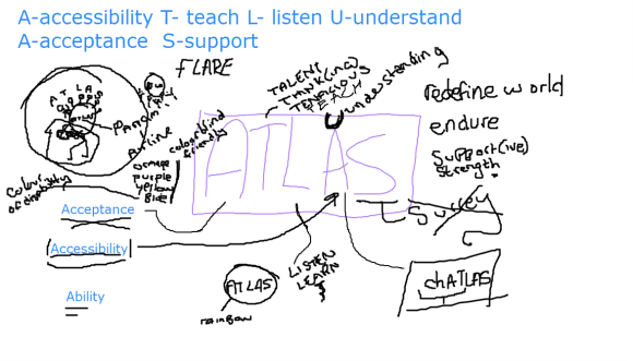
There was some discussion about whether the second A in ATLAS could be replaced with a U, but a few members said that the incorrect spelling really bothered them.
“[The words are] kind of in order of how we need professionals to act around the concept of participation. First, you must accept the existence of additional needs and disabilities, then you must be somehow taught about the importance of this (either through personal experiences, hearing experiences, or traditional learning), then you need to listen to young people with additional needs and disabilities about how they experience your services and the world, then make your services accessible, and support both young people with additional needs and disabilities in the service you provide and support the fight for equality generally.”
- Accept: there’s a level of professionals and society needing to accept that people with additional needs and disabilities are present and that their needs are important and that they are valuable members of society. And for people with additional needs and disabilities, acceptance is an important part of maintaining good mental health etc, as often for disabled people “recovery” etc is not the aim, they will always have their condition and they need to accept that.
- Teach: ATLAS teach professionals about their lived experience and give feedback on consultation work and also teaching each other and the UVP staff similarly.
- Listen: core concept of participation groups. Listen to each other, our team listening to them, professionals listening to the young people and vice versa. Active listening is just extremely important.
- Access: accessibility is a core part of the feedback that ATLAS give professionals and there is still a lot of work to be done to make society less disabling
- Support: the group support each other, we support the group, the group supports the professionals with their participation and that work supports society in making more accessible services.
The Logo
During the mind mapping session it was decided that the logo would be based loosely on the god Atlas, only instead of one man holding up the world, it is several people with different needs (everyone).
The ATLAS logo was designed by one of our members of the group following the discussion on the name ATLAS in group. They drew several different logos and showed it to the group for everyone to give their feedback!

The final logo involved a few changes to make sure that the logo was as accessible as possible, showed up well on the colour branding (which had been previously chosen by members), and was converted into a different file format.

